Information below written by Rob Carney and published October 16, 2018 on www.creativebloq.com.
If you’re embarking on a career in graphic design – perhaps by transforming a design internship into a job, or sending out a brilliant creative resume or design portfolio – there are some designers that you simply must know about.
These are the designers who have changed the way graphic design is seen in the contemporary world. They are the mavericks, the thinkers, and those who have made a difference to design.
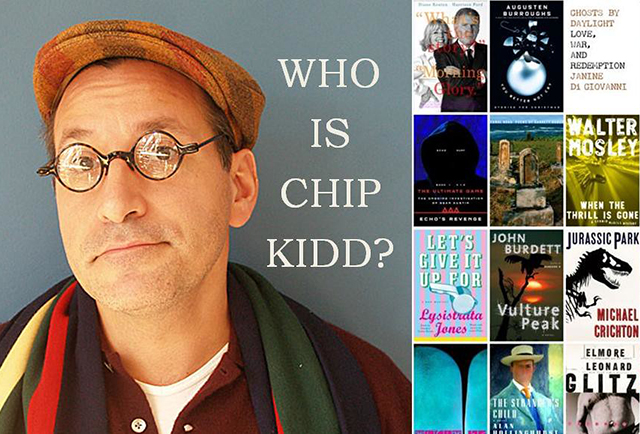
01. Chip Kidd
Based in New York City, Chip Kidd is best known for his stunning book jackets – most notably for seminal publishing house Alfred A. Knopf. Kidd has worked for writers such James Elroy, Michael Crichton and Neil Gaiman (among many others).
Jurassic Park is one of his most notable book covers, and in his 2005 monograph he explained the thinking behind it: “When trying to recreate one of these creatures, all anyone has to go on is bones, right? So that was the starting point…
“Not only was the drawing integrated into the movie poster, it became the logo in the film for the park itself. I think it’s safe to say that the Jurassic Park T-Rex became one of the most recognisable logos of the 1990s.”
Listen to Kidd’s hugely entertaining TED talk here. Oh, and if you want to see what you could learn from Kidd’s portfolio, check out our article.
02. Rob Janoff
Why do you need to know about Rob Janoff? Simple: he designed the Apple logo. Janoff masterminded possibly the most famous mark in the world today while at ad agency Regis McKenna back in 1977. And although it’s been tweaked, the basic form has remained the same ever since – a testament to its simplicity and longevity (and it was created in only two weeks).
Back in 2013, Janoff told us that the idea of an apple with a bite taken out of it was “really a no-brainer”. He continued: “If you have a computer named after a piece of fruit, maybe the image should look like the fruit? So I sat for a couple of weeks and drew silhouettes of apples.
“Bite is also a computer term. Wow, that was a happy accident. At that point I thought ‘this is going to have a wink and a nod with it, and give it personality’.”
And as for the now forgotten coloured stripes? “The big deal about the Apple II was that it was the only computer that reproduced colour images on the monitor, and it was the only computer that you could plug into your home colour TV.
“Also, a lot of it had to do with the aesthetic origins of both Steve [Jobs] and I, which was a kind of hippy aesthetic and The Beatles and Yellow Submarine.”
03. Peter Saville
Peter Saville is best known for his record sleeve designs for Factory Records artists – think Joy Division and New Order (Unknown Pleasures, Transmission, Blue Monday and more). But his sleeve work spans five decades. Saville is one of the most prolific record designers of all time, if not the most prolific.
But the Manchester-born designer’s work doesn’t stop at sleeve design. In 2004 he became creative director of the City of Manchester; he has worked with fashion’s elite including Jil Sander and Stella McCartney; and in 2010 he designed the England football home kit.
In 2013 he told The Guardian all about the latter: “The red and white thing has been entirely marginalised by one kind of person. It’s synonymous with an attitude that is naive, xenophobic, bullying and self-marginalising. I thought, that’s not reflective of the team, or football, or of the nation at all.
“But it turns out the market for those shirts are those bloody-minded xenophobic individuals with the shaved heads. When it came out, they did not like it. They did not like it at all.”
Born in 1955, Saville is still going strong – he recently redesigned the Burberry logo.
04. Michael Bierut
There aren’t many design agencies that are more respected than Pentagram – and becoming a partner is one of the ultimate design accolades. Designer and educator Bierut has been a partner for 27 years now and has won hundreds of design awards (he’s also got permanent work in MoMA). Before Pentagram, Bierut worked for 10 years at Vignelli Associates.
The designer’s projects at Pentagram include identity and branding for Benetton, the New York Jets, Walt Disney and design work on Billboard magazine. This is of course, just a small slice of his sprawling portfolio. Bierut is also a senior critic in graphic design at the Yale School of Art. Check out his Monograph – How To – published in 2015.
In 2013, we caught up with his to find out what he looks for in new talent: “The best are people who are bright and articulate, and have great work in their portfolio. I could sit with them all day,” he says. “The second best have great work but can’t talk about it intelligently. That takes work, but still it’s worth the effort.
“I like people who, in talking about their work, scratch below the surface. Don’t talk about typefaces and Photoshop effects; talk about the subject matter, and how that interested and inspired you.”
05. Massimo Vignelli
Massimo Vignelli died in 2014, taking with him a legacy of some of the most iconic design work of the past 50 years.
Counting IBM, Ford, Bloomingdale’s (his ‘Brown Bag’ designs are still in use today), Saks, American Airlines and many more as clients, and counting Micheal Bierut among his protégés, Vignelli’s legacy lives on. It lives on perhaps most prominently in the subway map and signage he designed for New York City in 1972.
At the time of his death in 2014, web designer Justin Reynolds wrote an in-depth guide for us on what we can all learn from Vignelli’s design principles.
In it, Reynolds wrote: “He was celebrated for his teaching as well as his work… Which means Vignelli’s legacy is of fundamental importance to all designers.
“The web emerged too late in his career to allow him to make a direct contribution to the medium, but the design principles that guided his work have had a profound impact upon the processes and aesthetics of both traditional and digital design.”
06. Jonathan Barnbrook
As David Bowie’s latter-career go-to designer, Jonathan Barnbrook has become even more prominent in recent times. But Barnbrook’s work is far deeper than Heathen, The Next Day and Blackstar.
Before Bowie, he was perhaps best known for his influential type design – Exocet becoming the most pirated font on the web shortly after release in 1991 (it was also used in the FPS video game Diablo).
Barnbrook’s VirusFonts foundry continued to thrive throughout the next couple of decades, with Bastard and Tourette being good examples of his still contemporary, but controversial, typefaces.
In an interview with us in 2012, Barnbrook said of Tourette: “Tourette is based on an early 19th century slab serif form. Having Tourette’s means that people move outside an agreed code of language… That’s what I was trying to say in Tourette. There are swear words that are banned, but it’s necessary that they appear in language as well, because we can’t calibrate it otherwise. And I do like swearing.”
Flip to the modern day and Barnbrook’s masterpiece of sleeve design for David Bowie’s sign off album Blackstar – the artwork from which was released for free – is every bit as good as the record itself. He also designed the all caps Exocet typeface.
07. Kate Moross
Kate Moross – creative director of Studio Moross – is an art director and designer from London who came onto the scene in 2008 with their trademark typography and energetic, fluid drawing style.
Moross has since become one of the UK’s most sought-after and successful designers, creating a myriad of album covers, magazine covers, branding, video and even live visuals for One Direction.
“I don’t think about things in terms of influence. I’m not at school any more,” Moross told Creative Bloq in an interview in 2011. “I don’t look at a painting by van Gogh and go off and do a van Gogh drawing in my sketchbook. I don’t read magazines, I don’t go to art galleries, I don’t engage with the culture in a traditional way that perhaps a lot of people do.
“I think I get most of my ideas from everyday life – going to the shop or interacting with the bus driver or seeing something by accident. I’m not one for organised culture or anything like that, so I do try to let things happen naturally. I definitely think your influences are to do with your character, your life, your mood and general culture like TV and film that you can’t really escape.”
08. Carolyn Davidson
There aren’t many logos that are more recognised the world over than Nike’s iconic swoosh. It’s often the simplest ideas that are the best and the Nike markproves it.
Graphic designer Carolyn Davidson designed the logo as a student at Portland State University in 1971 – and was paid $35 for it by Nike founder Phil Knight (Knight met Davidson in an accounting class he was teaching).
The tick-like logo was seen as a symbol of positivity, but it’s actually the outline of the wing of the Greek goddess of victory whom the brand was named after. In 2011, Davidson told OreganLive.com that “it was a challenge to come up with a logo that conveyed motion” and that Philip Knight was very impressed with the stripes of rival company Adidas – it was increasingly hard to come up with something original.
As Nike grew in the 1980s, Philip Knight gave Davidson an undisclosed amount of Nike stock (making up for the tiny fee for the logo, we’re sure).
09. George Lois
In terms of magazine design, George Lois was perhaps the original maverick. From 1962 to 1972 he enjoyed an incredible 10 years at US Esquire magazine, designing some of the most iconic, and perhaps controversial, covers in history – including April 1968’s Muhammed Ali cover. He had big ideas, presented in a simple way.
In an interview with Design Boom in 2014, Lois was asked about his ability to surprise. “When I create an image, I want people to take a step back in awe when they see it for the first time. I want them to be taken back first by the strength of the image, then by the meaning of the content. This makes people understand what’s special about a product or how exciting and interesting a magazine is.
“Another one of my strongest skills is making something memorable. If something is memorable, it stays in the consciousness, and that helps sales.”
As well as a successful magazine designer, Lois was also a top figure in the world of advertising, working for a raft of huge clients including MTV, VH1, ESPN and Tommy Hilfiger.
10. Saul Bass
It sounds like hyperbole, but Bass was probably the most important graphic designer of the 20th century. His work transcended graphic design, poster design, film titles, logos and more – with perhaps his most iconic work being opening sequences for Hitchcock.
In fact, his opening credit work spanned five decades – right up to his death in 1996. Some of his last work was for Martin Scorcese on Goodfellas and Casino.
In a 2011 article for the Telegraph, Scorcese reflected on Bass’ genius: “I had an idea of what I wanted for the [Goodfellas] titles, but couldn’t quite get it. Someone suggested Saul, and my reaction was: ‘Do we dare?’ After all, this was the man who designed the title sequences for Vertigo, Psycho, Anatomy of a Murder… and so many other pictures that defined movies and moviegoing for me.
“When we were growing up and seeing movies, we came to recognise Saul’s designs, and I remember the excitement they generated within us.
“They made the picture instantly special. And they didn’t stand apart from the movie, they drew you into it, instantly. Because, putting it very simply, Saul was a great film-maker. He would look at the film in question, and he would understand the rhythm, the structure, the mood – he would penetrate the heart of the movie and find its secret.”
As a logo designer Bass was also prolific, designing the marks for AT&T, Kleenex, United Airlines, Minolta and many, many more.
11. Morag Myerscough
For over 30 years, Morag Myerscough has been creating stunning supergraphic installations – grand scale installations, pop-ups and wayfinding graphics that bring spaces to life through her trademark bright colours.
Her clients – through her studio, Studio Myerscough – include London’s Barbican, Royal London Hospital and the Stockholm Kulturfestival.
In 2013, Myerscough revealed to Design Boom just what makes her tick: “What I enjoy the most [about environmental graphic design projects] is that people enjoy and respond to the places we make and it makes a difference to them.
“I put a narrative in the building; we make places where people feel they belong,” she says. Her awards include the Design Museum’s Design of the Year.
12. Lindon Leader
Leader by name, leader by nature, Lindon Leader is responsible for one of the cleverest logos out there, utilising negative space in a way never done before (at least for a huge global company). In 1994, Leader was senior design director at Landor Associates when the FedEx logo was designed. It was subsequently applied to 600 aircraft and 30,000 ground vehicles. Now there’s a portfolio piece.
Leader told us, in an interview in 2013, that Landor did around 200 designs for the logo before settling on a shortlist of 10 to show to the FedEx brand manager. And the use of white? Particularly that hidden arrow between the E and the X? “I cannot tell you how many times I fight with a client who says ‘I’m paying an enormous amount of money to pay for an ad in a magazine and you’re telling me you want 60 per cent of it to be empty space?’” he smiles.
“On the one hand I can understand where they’re coming from, but basically the average client does not have a sophisticated enough appreciation of white space to understand that it can be a strategic marketing tool.”
As well as FedEx, Leader worked on many high-profile branding projects while at Landor, quoting his favourites as Hawaiian Airlines, Cigna Insurance and Banco Baresco. But Leader understands just what the FedEx logo means: “While I think I’m blessed and privileged to have said I designed the FedEx logo, sometimes I think I’m going to go to my grave and that’s the only thing people are going to remember me for.”
- Herb Lubalin
Advertising director, graphic designer and typographer Herb Lubalin was perhaps most recognised for his work on magazines published by Ralph Ginzburg. Eros, Fact, and Avant Garde – all of which gave Lubalin unprecedented room for typographic experimentation.
He also gained acclaim for designing the typeface ITC Avant Garde, based on the logo font from the magazine of the same name. Lubalin passed away in 1981, having won the 1980 AIGA Medal.
The profile of his distinguished career on the AIGA site says: “Herb Lubalin’s unique contribution to our times goes well beyond design in much the same way that his typographic innovations go beyond the 26 letters, ten numerals and the handful of punctuation marks that comprise our visual, literal vocabulary. Lubalin’s imagination, sight and insight have erased boundaries and pushed back frontiers.”
It also says: “Typography is the key. It is where you start with Lubalin and what you eventually come back to. However, ‘typography’ is not a word Lubalin thought should be applied to his work. ‘What I do is not really typography, which I think of as an essentially mechanical means of putting characters down on a page. It’s designing with letters. Aaron Burns called it typographics, and since you’ve got to put a name on things to make them memorable, typographics is as good a name for what I do as any.’”
Marian Bantjes is a Canadian designer, artist and letterer. Her unique approach to typography, weaving it between often ornamental graphics, has built her a reputation as one of contemporary design’s most creative letterers, her striking portfolio backing this up.
In 2010, she released the beautiful monograph I wonder. In 2013, she released Pretty Pictures, published by Thames and Hudson in the UK/Metropolis Books in the US.
In 2013, she revealed to Nothingmajor.com her fascination with challenging the way type is seen: “I think I like the fact that you can push letterforms into so many different shapes. Like graffiti – I’m fascinated with graffiti – I think graffiti is so sophisticated typographically.
“I love the idea of something that’s recognisable and readable to those who know how to read it, but not everybody else. I like the continuum between the readable and unreadable, the variation there is within that. I just really love that ability to experiment with that and make forms that are interesting but that say something, but are not abstract.”
- Max Miedinger
Neue Haas Grotesk. Designed in 1957. Familiar? No? Well if not, this is the typeface that was renamed Helvetica in 1960. And Max Miedinger was the man behind the now-omnipresent typeface. As neutral as it is legible, Helvetica’s ubiquity has no doubt made it the love/hate typeface of today.
Meidinger learnt his trade in the 1930s, and after the Second World War he worked at Haas Type Foundry in Switzerland. The story behind Helvetica goes as such: the foundry needed a typeface to rival Akzidenz-Grotesk by H Berthold. It took Meidinger months to draft the new typeface before presenting it to the company’s director Eduard Hoffmann.
Neue Haas Grotesk was soon changed to Helvitia (to denote the typeface’s Swiss origins) before another tweak made it Helvetica.
It’s been used everywhere – from the American Airlines logo to BMW to, well, hundreds of big brands. And even today it’s the choice of designers wanting a clean, legible typeface that’s an expression of modernist perfection.
But Helvetica isn’t for everyone – after all, familiarity breeds contempt. If Helvetica is a bit too familiar for you, check out our list of alternatives to Helvetica.
While Mr Hyperbole Jony Ive is now responsible for all the icons you see on your Mac and iOS devices, we would never have got to this point without the inimitable Susan Kare – the designer responsible for the original icons and interface elements on macOS.
A creative director at Apple in the 1980s, Kare paved the way for what we see on our desktops every single day: the trash can, the happy/sad Mac, the Command key icon.
In our interview with Kare back in 2013, she reflected on her time at Apple: “I really enjoyed working with Steve Jobs, both at Apple and then later at NeXT [the company founded in 1985 by Steve Jobs after he’d been forced out of Apple]. He cared so much about every detail, was interested in design and graphics, and challenged you to do your best work.”
She’s still innovating now, with her portfolio boasting icons for Facebook, Microsoft, Wired and more. Kare also worked on the Geneva typeface, as we revealed in our post 5 fonts created by famous designers and why they work.
Erik Spiekermann has enjoyed a distinguished career in both graphic design and typography, but he’s best known for designing some of the most successful fonts of the last century.
FF Meta is possibly one of the most prominent, originally having being designed for the German Post Office.
So what makes a good typeface in Spiekermann’s expert eyes? “The alphabet hasn’t changed,” he smiles. “If it deviates too far then it will be disturbing. A shoe is a shoe. A triangular shoe is not going to work.
“But it has to have that little element in there that most people won’t even notice – something a little different. It has a different take; it may feel warmer or colder or squarer or whatever.”
- Paul Rand
Born in 1914, Paul Rand was an American art director and graphic designer. He was undoubtedly best known for his logo work, including that for one of America’s biggest companies, IBM. Rand’s first IBM logo was revealed in 1956 as part of the company’s new focus on the importance of design. Using a big, slab serif face, its statement was bold and confident.
Later on in 1972, Rand refined the logo, breaking it into eight horizontal stripes (reminiscent of the scan lines on the cathode ray tube monitors of the day) and introducing the distinctive IBM blue.
Interesting fact: Rand was actually born Paul Rosenbaum but when he established himself as a designer he shortened his name to Paul Rand – four letters for name and surname. His name became a symbol in its own right.
Rand also designed the logo for Steve Jobs’ post Apple venture, NeXT. On Rand, Jobs said: “I asked him if he would come up with a few options, and he said, ‘No, I will solve your problem for you and you will pay me. You don’t have to use the solution. If you want options go talk to other people.’” Rand passed away in 1996.
- Alan Fletcher
Alan Fletcher was one of the founding partners of Pentagram, and one of the most highly regarded graphic designers of his generation (and in fact, any generation). His work spans decades, but he was perhaps most prolific and recognised in his Pentagram years.
Fletcher’s logo for London’s V&A museum is testament to the timeless appeal of his work – designed in 1989, it’s still going strong. The relatively fragile Bodoni-style serifs work brilliantly with negative space to create a high-contrast, confident logotype.
Fletcher passed away in 2006, but check out the Alan Fletcher archive for a comprehensive journey through his career.
Milton Glaser is one of the world’s most celebrated graphic designers. His most famous work is undoubtedly the logo he designed for New York to promote tourism in the city in 1977.
Much used, adapted and adored, the I ❤ NY logo is set in American Typewriter, a rounded slab serif.
But Glaser is much more than the one logo. His work for Bob Dylan, DC Comics and The Brooklyn Brewery are just some of the logo masterpieces that cement him as one of the most prominent designers in history.
“The most important thing in design, it seems to me, is the consequence of your action, and whether you’re interested, fundamentally, in persuading people to do things that are in their interests,” he told us in an exclusive interview in 2009).
He’s also the man behind the geometric Glaser Stencil font and the subject of a 2008 documentary film Milton Glaser: To Inform and Delight.
Born in Austria, New York-based graphic designer and typographer Stefan Sagmeister enjoyed a career resurgence in 2012 when he made Jessica Walsh (number 22 in our list) a partner at his studio, now named Sagmeister & Walsh.
Just as he had done when he launched his own studio, Sagmeister announced the partnership with a naked photoshoot. It did the PR job.
But there’s more to Sagmeister than nudity. His often conceptual, thought-provoking work has turned just as many heads as his PR stunts: particularly his ‘cutting’ work for AIGA and his incredible album artwork for Lou Reed.
In recent times, Jessica Walsh has become one of the most recognised graphic designers in the world. In 2010, she was working at Print magazine where she reached out to Stefan Sagmeister for advice. He spent five minutes flipping through her book and offered her a position at Sagmeister Inc on the spot. “I quit my job the next morning,” she grinned when she related the story in our interview with her and Sagmeister.
Sagmeister confirms the attraction: “I immediately loved her sunny character and no-nonsense approach to work.” Walsh brought a fresh output to the already iconic design company, and in 2012 she was made a partner.
Another partnership, this time with photographer Timothy Goodman, also hit headlines. The duo’s 40 days of dating project documented their quest for love through illustration and design from some of the world’s leading designers. They replicated that success with a new project, 12 Kinds Of Kindness, in 2016.
As art director of music and lifestyle magazine Ray Gun, David Carson became the most influential graphic designer of the 1990s. His unconventional grunge typography style was a new era in design.
An example of his genius? Setting what he thought was a dull interview with Bryan Ferry entirely in the Dingbat symbol font.
The first edition of his End of Print monograph, first published in 2000, sold 35,000 copies – and many many more since. It’s essential reading for any graphic designer – new or established.
“What matters is that you have an intuitive design sense, listen to it and explore your uniqueness through your work,” he told us in this interview. “Create rules that work for you and the type of work you’re doing. I never learned all the things in school I wasn’t supposed to do, so I just did, and still do, what makes sense to me.”
English designer, typographer and art director Neville Brody shot to fame with his incredible art direction of cult UK magazine The Face between 1981 and 1986. He’s also well known for art directing Arena magazine (1987-1990) and designing record covers for artists such as Cabaret Voltaire and Depeche Mode.
Brody also founded Research Studios and redesigned The Times in November 2006 (with the creation of a new font, Times Modern) and the BBC’s website in September 2011.
In our Classic Interview with Brody from 1995, he made this forward-facing prediction: “The mistake people have made is to assume that the computer is just a tool. It’s not just a labour saving device like a food mixer or washing machine. The computer is a new medium like television or cinema. Or books.”
And in our slightly more recent interview, when asked how he feels about being a design icon, he quipped: “You can’t even think about that. You don’t wake up in the morning and say, ‘Hey! I’m a design icon! What shall I do today?’ You’re finished if you do that! Imagine!”
Paula Scher has been a design educator since 1992, teaching at the School of Visual Arts (SVA) in New York
Partner at Pentagram and almost certainly the most influential female graphic designer alive today, Paula Scher’s branding and identity work for the likes of MOMA, New York City Ballet, Microsoft and NYC Transit is some of the finest examples of the genre you’ll ever see. Her typographic maps are also sublime.
In our interview with Scher from 2009 on learning from design mistakes, she said: “When I worked at CBS, from the mid-1970s to near the end when the money ran out, that was a pretty wonderful time for designing because I could make discoveries in a free way – largely because I had a lot of work to do and so much of what I did was terrible.
“…To get good, you have to get really bad. You have to make some terrible, horrible mistakes.”