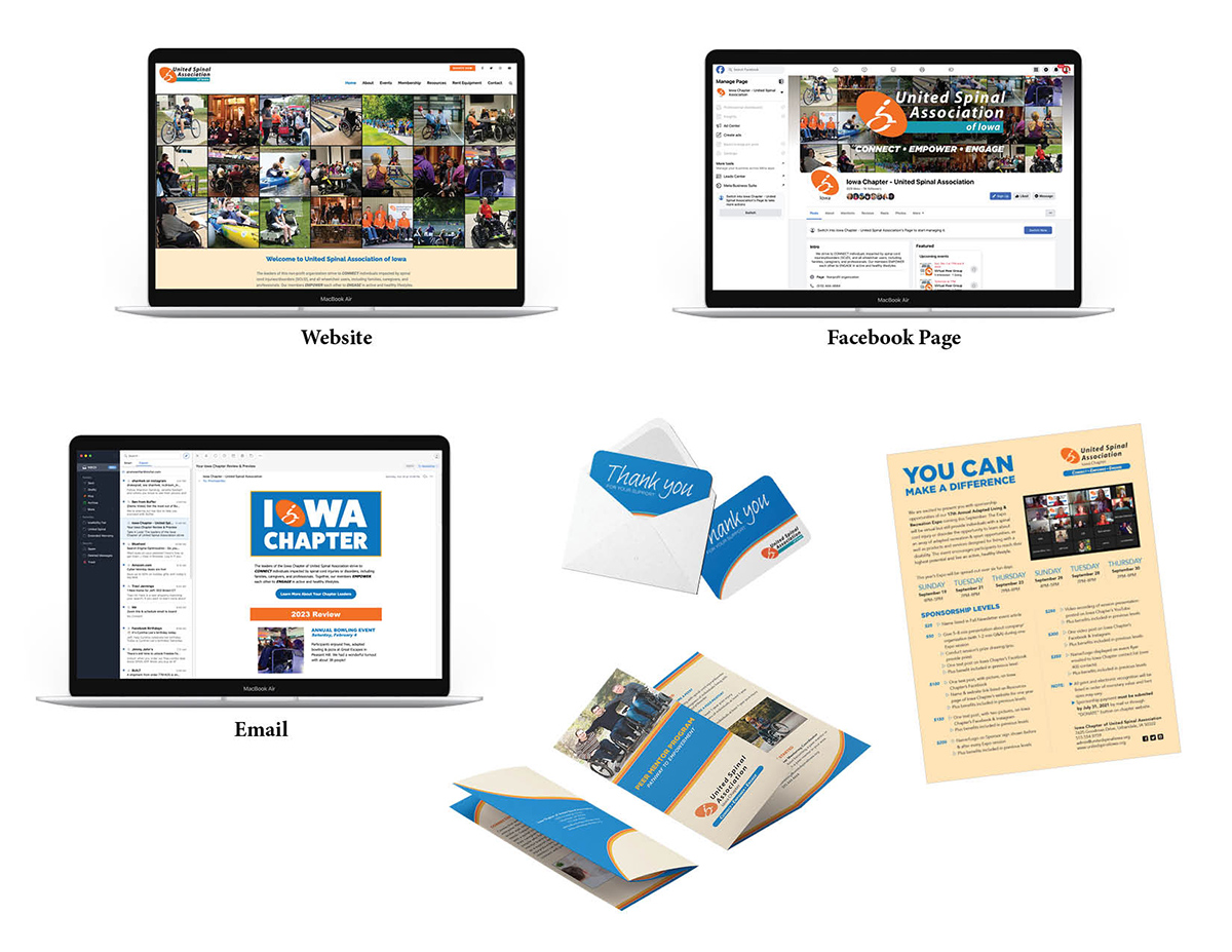
United Spinal Association of Iowa needed a cohesive look for all of the mediums it was using to communicate. To begin, a color scheme was established to be used on everything. After that, ALL communication materials were redesigned, which included its website, letterhead, brochures, flyers, social media, emails, and more. They currently don’t have an established set of fonts to use, but are headed that way to better define the brand.*
You can view a couple of the materials I wrote and designed by clicking on the thumbnail images. Click hereto see the email I designed.
Software used:
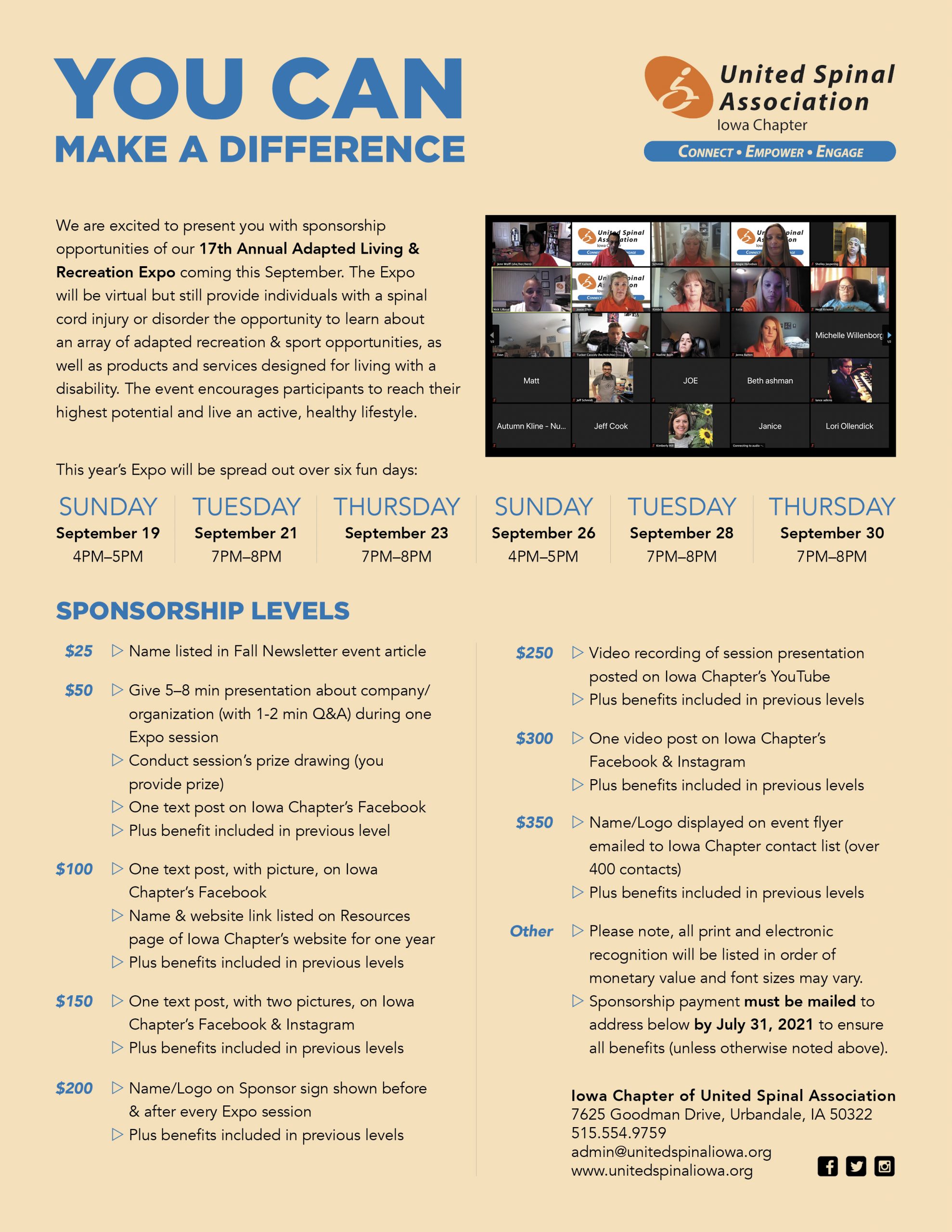
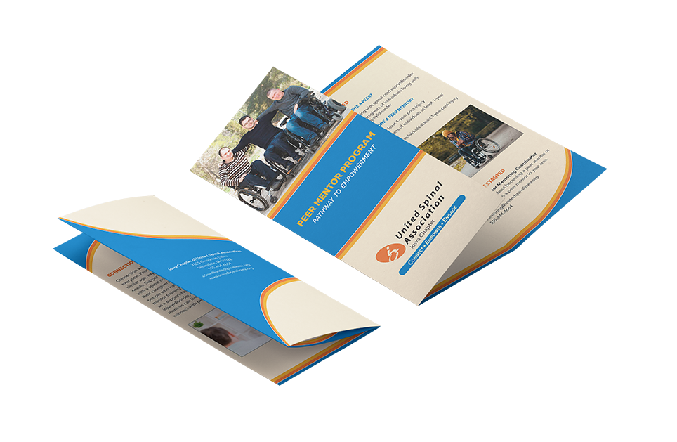
Brochure, thank you card, and sponsorship sheet were created in InDesign
Email banner image created in Illustrator
Email constructed in Constant Contact
*Please note: The organization’s logo recently changed, which includes a new teal color. Some of the design samples precede this change.
Red Rooster Records, a small local business, was in great need of a new, professional, cohesive brand identity. After conducting research on the business and its competitors, that brand was created. View Red Rooster’s branding bookletfor details about the business, the thoughts behind the design process, and more samples of how the new brand could be applied.